Dear lab cats
This week’s development post will be about our new website and our designer Katia. We thought it was about time we introduced the people in our team a little bit more. At the same time, you might learn something from the way she works. This post will be a little interview with questions about her work at CatLab and her interests.
The Website
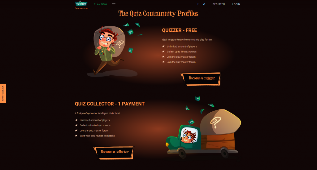
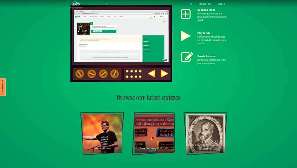
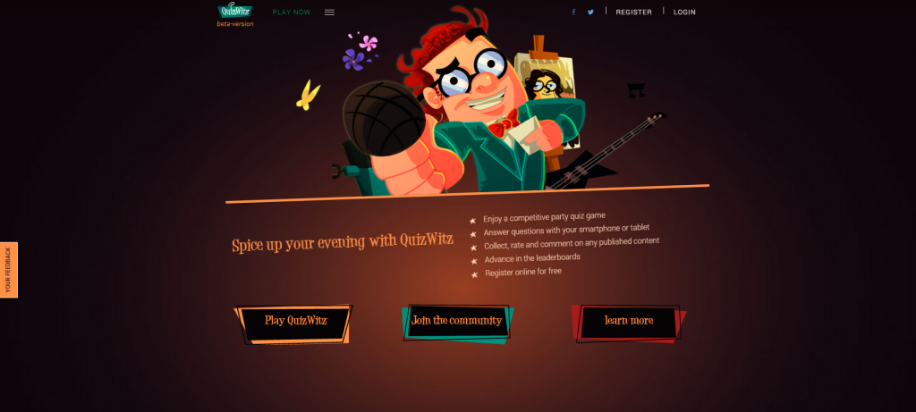
Our new website will approach different people in their unique way. We created different content for different audiences. A quiz creator will search in a different way than a party quizzer. Someone who loves to play online and talk to people in the community on the other hand, will look for even different terms. We added screenshots at the end of the post if you’re interested, you can also visit them here:
The Interview
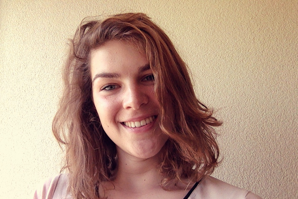
First things first though. Here’s our little interview with the designer of the QuizWitz community and website. Do note though that the party game itself was designed by a freelancer before we even knew Katia!
So, what do you actually do for CatLab?
At Catlab I have a varied job. Last year I created the designs for the Catlab-website, QuizWitz-website and QuizWitz community network. I also developed those first two websites. Besides that I’m a helping hand in the front-end development of the game and the social platform.
Furthermore I like to do some social media management so I started the FanFacts-tweets.
What do you study now?
At the moment I study Devine at Howest University College in Kortrijk. Devine is a contraction of design and development so the degree is divided in those 2 parts.
I’m going to my second year where I will learn more about Javascript frameworks, 3D Motion Graphics, API’s, …so I’m very excited to start the new academic year.
How do you keep up with the industry? Are there any blogs or sites you follow regularly?
I follow a few inspiring people on Twitter which helps you to stay up to date. I also like to check inspirational projects on Behance and Codrops. Next to that, I follow some inspiring Facebookpages like CSS Design Awards , creativeBloQ , you the designer and many more.
Could you walk us through the steps you follow when you create a website?
First I like to brainstorm about the content of the website and how to visualize it. In this stage I like to browse through Behance, Pinterest, awwwards.com and cssdesignaward.com
When I’ve got some nice ideas I start sketching and wireframing. After that, when I’m happy with some sketches I start the digital design in Illustrator. At that moment I also brainstorm about some nice effects and I keep good UX in mind.
When the digital design is finished and I got some feedback from third parties, I start with the front-end development.
In the last stage I add some animations and try to test the website as well as possible on a lot of different devices.
Do you look up to any inspiring people in the field?
There are some people I keep an eye on, but it changes because I’m still learning and exploring my way of working. It also depends on the fields they are active in.
Photography
Branding
Webdesign
Illustration/Character design
Can you think of any tips and tricks that might help other people too?
Take your time to get a good result. Relax from time to time and start over when you’re not 100% convinced.
It’s harder to change your design and code afterwards than to start from a strong, well-considered idea.
Screenshots of the new website!
